

Meteor Autoform Modals
Adds bootstrap modals to insert/update/remove docs from Meteor collections.
Setup
meteor add yogiben:autoform-modals- Include the template in the layouts that will use the modals
{{> autoformModals}} - Use
afModaltemplate to create a button that will trigger the modal
##Example Button Markup##
Insert Example
{{#afModal class="btn btn-primary" collection="Posts" operation="insert"}}
  Add a new post
{{/afModal}}
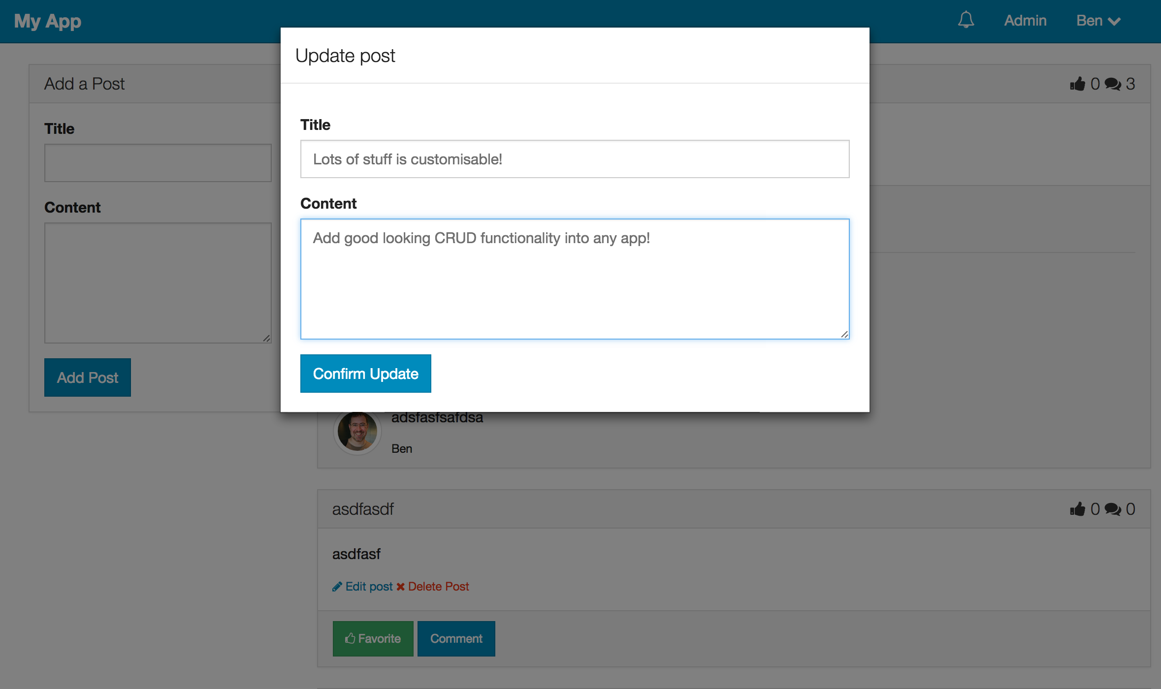
Update Example
{{#afModal class="btn btn-primary" collection="Posts" operation="update" doc=_id}}
  Update post
{{/afModal}}
Remove Example
{{#afModal class="btn btn-danger" collection="Posts" operation="remove" doc=_id}}
  Delete post
{{/afModal}}
Example with customisation
{{#afModal class="btn btn-primary" collection="Posts" omitFields="createdAt,owner,upvotes" operation="update" buttonContent="Update Challenger" prompt="Use this form to update your doc" title="Update your great content" buttonClasses="btn-success"}}
  Update your post
{{/afModal}}
##Usage##
Use afModal template to create a link that will trigger the modal.
The required attributes of this template are collection & operation.
Collection should be the name of the global collection object e.g. Posts.
Operation can be insert,update or remove.
If operation="update" or operation="remove" you also need to set the doc property to the _id of the document or to an object containing the document. This object must contain the _id of the document. If operation="insert" you can optionally set the doc property to an object containing some data you want to insert into the document (but you can't use the _id instead of the object and the object shouldn't contain the ```_id`` either).
Customisation
It is possible to customise the modals by adding additional attributes to the afModal template.
titlewill be the title of the modal (default to html of the button clicked)buttonContentis the html content of the modals' button (default to html of the button clicked)buttonClassesallows you to add different classes to the submit button. See the autoform docs.closeButtonContentis the html content of the modals' close button (not visible by default). Please note currently this feature is available onoperation="remove"dialogs only.closeButtonClassesallows you to add different classes to the close button.fieldsis a comma separated list of the only fields that should be in the form. See the autoform docs.omitFieldsis a comma separated list of fields to omit. See the autoform docs.prompta paragraph appears above the form / delete button. Defaults to 'Are you sure?' on delete.templateany template string that autoform accepts. See the autoform docslabelClassdefines a bootstrap class for use when the horizontal class is used, how many columns should the label take? For example:
labelClass='col-sm-3'
inputColClassdefines a bootstrap class for use when the horizontal class is used, how many columns should the input take? For example:
inputColClass='col-sm-9'
placeholderset to true if you wish to use the schema label for the input placeholder.formIddefines id of thequickFormtemplate. Useful when you want to set your custom autoform hooks.backdropdisables or enables modal-backdrop. Defaults to true (modal can be dismissed by mouse click). To disable use 'static' value. (See more here)meteormethodif specified meteor method will be called on submit. This has the same effect as passingtype="method"andmeteormethodto autoform template. See autoform docs for more details.onSuccessfunction to be called when operation succeeds. Currently it's supported foroperation="remove"only.dialogClasscan be used to add additional class for.modal-dialog(e.g.modal-sm)
Callbacks/Hooks
It's possible to add your own autoform callbacks/hooks by setting the formId.