

Autoform File
Description
Upload and manage files with autoForm for materialize
Forked from yogiben:autoform-file
Quick Start
-
Install
meteor add gildaspk:autoform-file-materialize -
Create your collectionFS (See collectionFS)
@Images = new FS.Collection("images",
  stores: [new FS.Store.GridFS("images", {})]
)
- Make sure the correct allow rules & subscriptions are set up on the collectionFS
Images.allow
  insert: (userId, doc) ->
    true
  download: (userId)->
    true
and
Meteor.publish 'images', ->
  Images.find()
and in your router.coffee
  @route "profile",
    waitOn: ->
      [
        Meteor.subscribe 'images'
      ]
- Define your schema and set the
autoformproperty like in the example below
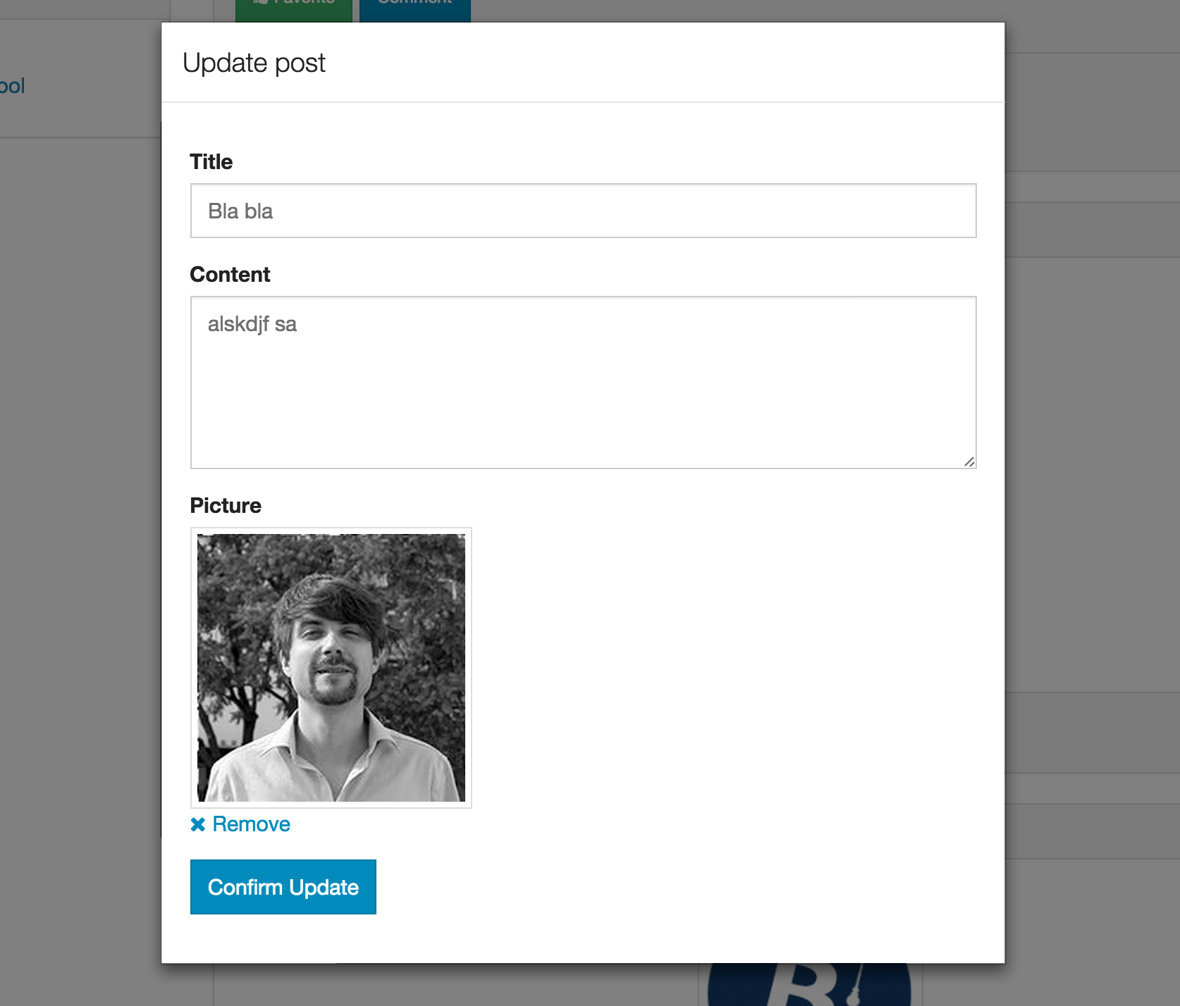
Schemas = {}

@Posts = new Meteor.Collection('posts');

Schemas.Posts = new SimpleSchema
	title:
		type:String
		max: 60

	picture:
		type: String
		autoform:
			afFieldInput:
				type: 'fileUpload'
				collection: 'Images'
        label: 'Choose file' # optional

Posts.attachSchema(Schemas.Posts)
The collection property is the field name of your collectionFS.
- Generate the form with
{{> quickform}}or{{#autoform}}
e.g.
{{> quickForm collection="Posts" type="insert"}}
or
{{#autoForm collection="Posts" type="insert"}}
{{> afQuickField name="title"}}
{{> afQuickField name="picture"}}
<button type="submit" class="waves-effect waves-light btn">
  <i class="mdi-content-send.right"></i>
  Insert
</button>
{{/autoForm}}
###Security & optimization###
The above example is just a starting point. You should set your own custom allow rules and optimize your subscriptions.
The remove button delete the file from your CFS collection. Take care to update your document accordingly or you'll get invalid references.
Customization
You can customize the button / remove text.
Defaults:
{{> afFieldInput name="picture" label=">" remove-label="Remove" placeholder="Please select a file"}}
You can add metadata to your file:
Template
{{> afFieldInput name="picture" metadata=metadataHelper}}
Helper
Templates.myTemplate.helpers({
  metadataHelper: function(){
    return {
      userId: Meteor.userId()
    }
  }
});
You can enable drop zone by setting dropEnabled to true (default is false).
Dropzone CSS classes can be defined with dropClasses (default is card-panel grey lighten-4 grey-text text-darken-4)
Dropzone text can be defined with dropLabel (default is Drop your file here)